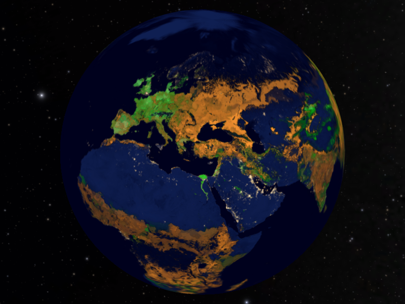
For as long as I can remember I’ve liked maps. I’ve really, really liked maps. Somewhere along the way it certainly involves spending way too much time looking at the back pages of Dune and the Lord of the Rings, and led to many hours of my youth drawing my own maps of imagined planets in pre-adolescent science fiction world-building.

I might like maps more than most people. To reference the xkcd comic I even have a favorite map projection. But I don’t just like maps because they look pretty. I like them because of what they can do.
Maps are a part of the way we visualize the spatial dimension of the world around us. They let us anchor ourselves in time and space and make meaningful comparisons. And, in the case of the planetarium, they’re part of turning back from the vast, cosmic scales we sometimes look at (which is, of course, done via a 3D map of the Universe…), down to local, personal, digestible scales.
For me, and hopefully audiences out there, maps are a really great way to represent data. Sure, there’s something to be gained from charts and graphs and spreadsheets of country data… maybe smaller regions too, but at some point it can get broken down to no longer being meaningful. I don’t think most people can look at an arcminute-by-arcminute table of data and get something out of it. It would definitely make for a big, long, ugly, bar graph. But make a map out of it? Now it’s a visual story, it’s an experience. It contextualizes smaller stories as part of a global whole. It becomes human data, scaling from individuals all the way up to the combined whole of humanity shaping our world.

Yields and yield gaps for maize, wheat & rice. It might not seem like the most exciting data, but it tells an amazing story of land management and what we need to do to feed the growing population of Earth. Data from earthstat.org, University of Minnesota.
It’s pretty awesome how maps can visualize invisible data. But there’s another feature I adore—especially when it comes to maps of other planets.

Pictured: Other planets.
We’ve been living in the age of Google Earth for a solid decade now. Ten years prior to that, Neal Stephenson wrote what may have been the inspiration for it in the 1992 novel Snow Crash:
There is something new: A globe about the size of a grapefruit, a perfectly detailed rendition of Planet Earth, hanging in space at arm's length in front of his eyes. Hiro has heard about this but never seen it. It is a piece of CIC software called, simply, Earth. It is the user interface that CIC uses to keep track of every bit of spatial information that it owns — all the maps, weather data, architectural plans, and satellite surveillance stuff.
I — and maybe you — had a computer in 1992. The OS still booted form a 5 ¼” floppy. The idea that you could gather, store, index and visualize that amount of data — in 3D no less (my 3D computing experience was limited to repelling the alien invasion in Arcticfox) — was pretty unbelievable.

The Antarctica I defended from oxygen-stealing aliens looked nothing like this.
Here we are, a little more than 20 years later, and for the last decade we’ve been able to pull this kind of data down from remote servers, glide (almost) seamlessly from the global view to our personal, daily lives (experiments with floor programming suggests the first thing anyone looks for is their own house).

House… workplace… same thing, right? Imagery OnTerra Systems/Bing Maps.
Beyond this cool personal experience, this kind of data is becoming easier and easier to use in dome theaters, letting us create powerful, shared, immersive experiences. As more planetarium software packages add these capabilities, more than a few colleagues have imitated the Eames’ brothers with a localized homage to Powers of Ten. But in planetariums the intersection with astronomy lets us leverage this same technology to explore other worlds. The Moon and Mars are mapped in astonishingly high resolution (and there’s some awfully good data for Mercury, Vesta, the Galilean Moons, Saturn’s major moons, Triton and now Pluto!).
With experienced guidance taking this data into the dome does something magical. It turns these distant planets into something more than just an abstraction out in space. They become real places we can visit on familiar, personal scales. The spaceship of the planetarium does more than just cruise in orbit. We can settle down and land in the Gale Crater, as if we were standing next to Curiosity and look up at Mount Sharp. We can sail over the lunar mountains; even see the real equipment astronauts left there decades ago.

Dune fields at the base of Mt. Sharp: ACTUAL REAL PLACE IN THE SOLAR SYSTEM. Imagery JPL MarsTrek, NASA LMMP, Mars Reconnaissance Orbiter.
That’s cool. That’s moving. That’s magical. Especially in a group—getting something you don’t get at a computer screen or in a headset. The shared experience of awe.

And I think that’s what’s really cool about what planetariums can do these days. They take what seem like abstractions to our audience (and ourselves!) and make them into something we can experience; make them into something that feels real. Maps—good maps—are just one part of that. But they’re a part I get really excited about, and I’d love to see more of them in planetariums.


